One-to-Many: One application, many platforms
Filemaker is an excellent tool for quickly designing great looking custom applications that can be simultaneously deployed on iOS, Mac, Windows, and the Web. Using FileMaker as your single development environment, and writing a single source code, it is possible to rapidly build a powerful application that natively supports many platforms.
Many-to-Many: Many platforms, many, many (many) layouts
The problem is each one of those platforms has different "form factors" and feature sets, especially iOS. To truly create an optimal user experience on all supported platforms, FileMaker developers need to design unique user interfaces and layouts for each platform they wish to deploy on.
In theory, this means that each form could end up needing to be designed in as many as seven (7) different versions: FileMaker Pro Mac, FileMaker Pro Windows, WebDirect for desktop browsers, WebDirect for smartphone browsers/screen sizes, Web Direct for tablet browsers/screen sizes, Filemaker Go for iPhone, and FileMaker Go for iPad.
In practice, to accommodate all platforms the most you would truly end up designing would be anywhere from three (3) to at most five (5) versions of each layout: Desktop (Mac/Windows), WebDirect for desktop/tablet browser, WebDirect for smartphone browser, FileMaker Go for iPhone and FileMaker Go for iPad ...Except for... the screen rotation complication, especially on iOS devices.
Rotations, rotations
On smartphones and tablets, users can easily (and often do) rotate their devices, however most modern iOS devices no longer respect FileMaker's instruction to "lock" the screen in a particular orientation. That means that, when designing FileMaker user interfaces, in addition to designing forms for each platform developers also need to accommodate landscape and portrait orientations.
Anchors away!
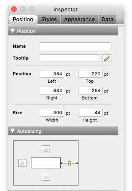
But what if you are in a hurry? What if you need to quickly put together some FileMaker Go forms for iPad but don't have the time to design portrait and landscape versions of each form? Here's a great user interface trick for laying out iPad compatible forms for use in FileMaker Go that will work no matter which way the user rotates their iOS tablet.

(Uncheck the top and bottom "padlock" anchors shown above)
The solution? Remove all top and bottom positioning anchors from your form elements and simply let them all "hang loose" vertically. Then, make your form dimensions 768 pixels wide by 660 pixels high. This "golden ratio" is at the intersection between portrait and landscape view on an iPad. Finally, make all your objects fit within that space and you're done.
Experiment by rotating your form on an iPad to fine tune the results. Depending on your needs, objects located at the very top and bottom of your form may need to be either completely unanchored or anchored to the top or the bottom of the screen. Not very scientific, but that's it! Sound simple? There's a catch...
First, forget Desktop and Web compatibility. This layout "technique" only works because the fixed "letter box" confines of an iPad's rectangular screen dimensions act as your "bounding box". If you view any of these forms on the desktop or on a web browser, where it is possible to resize the window vertically as well as horizontally, all form elements will be repositioned and your interface will fall apart.
Secondly, because of the 768 pixel width limitation, it is not possible to fit too many fields side by side. Finally, this technique is only useful for Form View mode and would prove of little use in List View mode.
The proof is in the pudding
Having said all this, we can testify that this technique will solve your landscape and portrait orientation problem. How do we know? Because back in February we used it ourselves to quickly throw together a contact form for the FileMaker Business Alliance's Partner Fair. Below is a sample layout from that app that demonstrates this interface technique.


Comments